Color can change how large a room feels, how energized you are when you walk in, and how your furnishings read against the walls. When you understand the science behind color, you can stop guessing and start selecting hues that consistently look stunning under morning light, late afternoon shadows, and warm lamplight in the evening.
You want a home that feels cohesive, calm, and purposeful. That requires more than grabbing a popular shade from social media. It means learning how your natural light direction impacts each hue, how undertones can clash or harmonize, and how to test colors in a way that mirrors real life. This guide will give you the framework to choose paint with confidence so that your spaces feel intentional and polished.
How Human Vision, Light, and LRV Shape What You See
Your eye does not perceive paint in isolation. It reads color in relation to surrounding hues, the temperature of your light sources, and the amount of light bouncing off a surface. This is why the same swatch that looked airy and crisp in the store can feel dull or flat at home. The environment is the real variable, not the paint formula.
Light Reflectance Value, or LRV, is a number most major paint brands publish that tells you how much light a color reflects. Higher numbers read brighter and can visually expand a room, whereas lower numbers absorb light and can make a ceiling feel lower or walls feel closer.
When you compare two similar colors, check the LRV to predict how much they will brighten or mute the space. You will make smarter choices if you stop relying only on the paint chip and start using this measurable data point.
Read Your Natural Light: Orientation Changes Everything
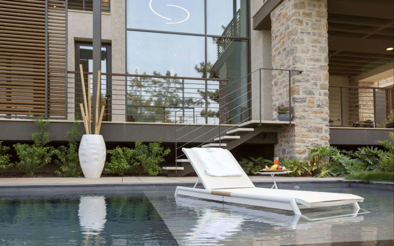
Before you pick a palette, study how daylight moves through your rooms. North-facing spaces tend to receive cooler, softer light that can emphasize blue or gray undertones. South-facing rooms are typically bathed in warmer light that can soften cooler colors and intensify warm ones. East-facing rooms glow early in the day and cool off by the afternoon, while west-facing rooms can feel moody in the morning and golden in the evening.
Walk through your home at different times and take notes. Notice when the space looks flat, when it feels vibrant, and where shadows pool. A pale gray with a touch of warmth can correct a cold north-facing room. A fresh, slightly desaturated green can balance a sun-drenched, south-facing living area. When you know your directional light story, you can intentionally counterbalance it with the right undertones.
Undertones, Temperature, and Why “White” Rarely Means White
Every color carries an undertone. Whites can lean creamy, blue, green, or even pink. Grays might tilt warm with brown or taupe or cool with blue or violet. Beiges can skew toward yellow or red. If you hold several “whites” side by side, you immediately see their bias. That bias is what makes a room feel welcoming, crisp, moody, or flat.
Think about how you want a room to function. Warm undertones tend to feel cozy and inviting. Cool undertones read calm and clean. Neither is universally better. You want the correct balance for your architecture, daylight, flooring, and furnishings. If your hardwood floors are rich and warm, a slightly cool neutral can keep the palette controlled and modern. If your stone counters are blue-gray, a softer, warm greige can prevent the space from feeling sterile.
Color Psychology by Room: Function First, Mood Next
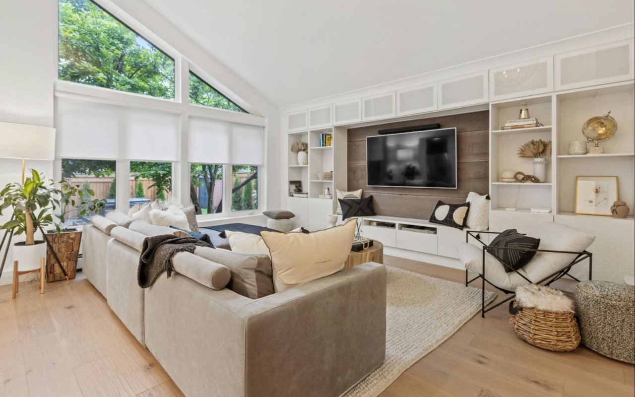
You experience color emotionally, even if you do not notice it. Soft, muted blues and greens are often associated with rest and clarity, which makes them excellent options for bedrooms or reading nooks. Warmer neutrals and gentle earth tones create relaxed, comfortable living areas. Energizing hues like corals or vivid greens can be effective in creative spaces or home gyms, where you want momentum and focus.
However, psychology should never override context. That deep charcoal accent wall might look sophisticated in a well-lit living room, and yet the same tone could feel too heavy in a narrow hallway with low ceilings. Let mood guide you, then refine by testing and observing the way your specific light conditions transform the paint across the day.
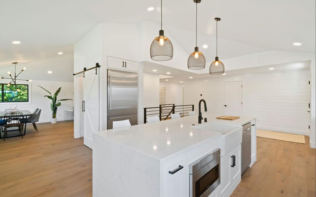
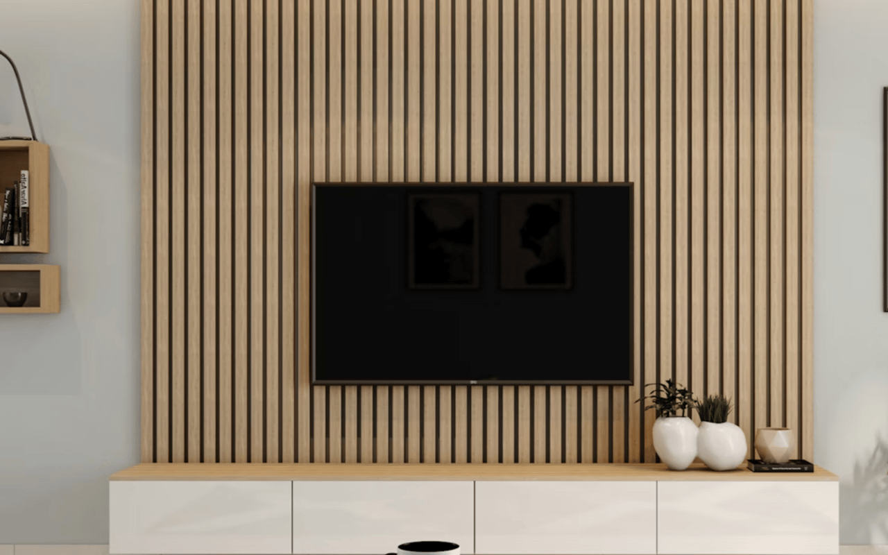
Why Neutrals Still Matter and How to Choose the Right One
Neutrals are powerful because they let your architecture, artwork, and textiles do the talking. They also vary dramatically. A warm greige with a touch of taupe can make a space feel grounded and timeless, while a cooler, blue-leaning gray can modernize traditional millwork. The wrong neutral, though, can make trim look yellowed, tile look dingy, or countertops feel mismatched.
Start by auditing your fixed elements. Look at your tile, stone, cabinetry, metal finishes, and flooring. Identify their undertones first. Then, select a neutral that complements rather than fights those tones. If your marble counters have a cool, blue-gray vein, choose a wall color with similar or neutral undertones to achieve harmony. If your oak floors read orange, try a neutral that tempers that warmth, not one that intensifies it.
Building a Whole-Home Palette That Flows
A cohesive home palette does not mean repeating the same color everywhere. It means selecting a family of tones that share undertones, depth, or temperature. You can create flow by repeating a primary neutral across the main circulation areas and then introducing accent colors in rooms where you want distinct character.
One practical method is to choose one anchor neutral, one mid-tone accent, and one deeper shade for contrast. Then, vary the application. Use the neutral in shared spaces, the mid-tone in secondary rooms, and the deeper color for architectural elements like interior doors, built-ins, or an office. This helps the eye travel comfortably from space to space without losing interest.
Finishes Matter
Finish choice affects how a color reads and how durable it is. Matte finishes minimize surface imperfections and create a soft look, which is ideal for ceilings and low-traffic walls. Eggshell provides a slight sheen and improved cleanability, making it a great choice for living rooms and bedrooms. Satin or semi-gloss finishes bounce more light, read brighter, and clean easily, which makes them popular for trim, doors, and high-use areas.
Be consistent with your trim and door sheen throughout the home. A unified sheen on those details creates a crisp framework for your colors and strengthens the whole-house palette. When you test colors, test finishes, too. A gray in eggshell can look noticeably different than the same gray in matte.
Confident Color Starts With Observation and Testing
Once you understand how light, undertones, LRV, and finish work together, you start designing with intention. You evaluate how each room functions, how daylight moves, and how your fixed elements influence harmony. The result is a home that looks polished all day, photographs beautifully, and supports the way you live.
If you’re ready to find the property of your dreams or prepare your Kingston, TN, home for a seamless sale,
Kathy May-Martin is in your corner. Reach out today.